With the massive growth of smartphones and tablets in the last couple of years, if you aren’t optimizing your website for these devices, then you are potentially alienating your audience.
In this article, I’ll explain the concepts of mobile aware sites and the best options available to ensure your website is optimized for mobile devices.
Firstly, let’s look at the chart below which shows smartphone penetration in 2012 as a percentage of population.
Source: Our Mobile Planet
With a few exceptions, most major countries have a smartphone penetration rate of around 30%-50%.
Increasingly, people are getting rid of their traditional laptop or desktop computer and solely utilising their smartphone or tablet device.
Main Approaches To Serving Mobile Content
Broadly speaking, there three main approaches to serving up content for mobile devices.
1. Separate Mobile Site
This was the most common approach used when mobile devices first came on to the market and is still used by a lot of major websites. The website is effectively duplicated, onto a separate website which is optimized for mobile devices.
There is no particular standard for the domain name for a mobile version of the website. Say example.com was the main website, then some of the naming formats typically used for the mobile version re:
[pre]m.example.com
wap.example.com
example.mobi
[/pre]
Advantages
- The user gets to choose which version of the website they want to view.
- The mobile version of the website can be heavily optimized to ensure good response times for viewers using mobile devices via a mobile network.
Disadvantages
- Effectively two versions of the site need to be maintained.
- Some sites rely on the user manually selecting the mobile version of the website.
2. Adaptive Design
This is where the website automatically detects what type of device you are using and serves up an optimized version for it. As this is done automatically, it means the URLs are the same whether you are browsing via a traditional laptop or a smartphone.
Advantages
- The process is transparent to the end user.
- You can do different types of optimization depending on the type of mobile device being used to view the site.
- Bandwidth savings for mobile users.
Disadvantages
- Additional maintenance is required to produce an optimized version of the site for all supported mobile devices.
3. Responsive Design
With responsive design, you have a single version of your website that serves up the same HTML regardless of the device, and the CSS is what dictates how the site will look.
Effectively a site that uses a responsive design will resize correctly to be viewable on any screen size.
Advantages
- You have a single version of your website.
- Your layout will respond to any screen/device size.
Disadvantages
- It does offer a truly optimized mobile version of your website in terms of bandwidth or navigation.
- Relies on mobile devices that support CSS3 and Javascript
Video Demonstration
The short video below shows the differences between responsive and adaptive website designs.
Google’s Recommendation
Google has two types of crawlers:
- One for regular websites
- One of mobile content
Google recently issues their set of recommendations for building smartphone optimized websites.
The three different types of configurations they support are:
1. Sites that use responsive web design, i.e. sites that serve all devices on the same set of URLs, with each URL serving the same HTML to all devices and using just CSS to change how the page is rendered on the device. This is Google’s recommended configuration.
2. Sites that dynamically serve all devices on the same set of URLs, but each URL serves different HTML (and CSS) depending on whether the user agent is a desktop or a mobile device.
3. Sites that have a separate mobile and desktop sites.
Note the sentence in bold that Google recommend responsive web design. Of course, this is only their recommendation and there isn’t any evidence to suggest if you use the other methods that Google will look on your site unfavourably.
Testing How Your Site Looks On A Mobile Device
The most obvious way is to simply use your smartphone or tablet and view your site. However, not everyone has a smartphone and it is difficult to cater for large variety of devices out there.
That’s where an emulator comes in handy, as it let’s you easily test the look of a site using various devices.
Note that there are some limitations (mainly they don’t have a zoom option) with emulators as they won’t always give you exactly the same result as using the actual device itself, but in most cases, emulators provide a quick and easy way to check your site.
In the video below, I cover the best smartphone emulators and testing tools that I’ve found.
Screenfly
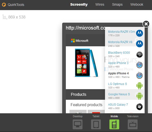
Screenfly by QuirkTools is the best online emulator I’ve found. It emulates:
- Desktop devices from a 10″ notebook up to a 24″ desktop
- Tablets including Samsung Galaxy, Apple iPad and Morotola Xoom
- Mobile devices including Blackberry 8300, iPhone, Google Nexus and ASUS Galaxy 7
- Television including 480p, 720p and 1080p
The screenshot below shows the Microsoft homepage being displayed on an iPhone 4.
Mobilizer
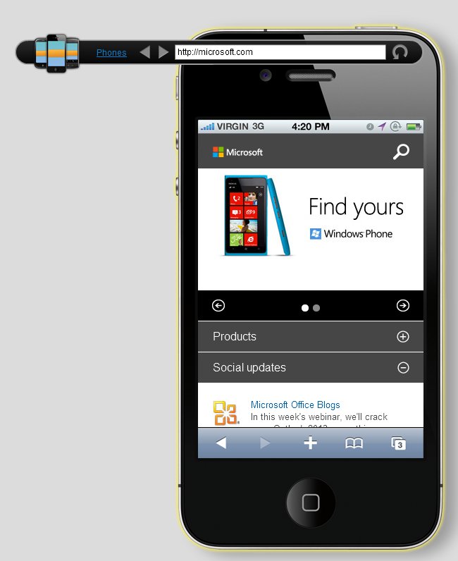
If you prefer to run an emulator on your own computer, then Mobilizer is about the best one I found. It runs on Adobe AIR, which means you can run it on PC or a Mac.
At the time of writing, it only emulates four different types of smartphones, but it has some additional features that make it worth while using, including:
- The ability to open multiple devices at once and simultaneously see the differences one each device as you navigate the site.
- Export a screenshot of the device and web page it is displaying.
The screenshot below shows the Microsoft home page again in the Mobilizer iPhone 4 emulator:
Mobile Support For WordPress
As WordPress is so popular, I wanted to cover the main options for improving your site so that it is compatible with smartphones and other mobile devices.
The options for WordPress come down to two main approaches:
- A Responsive theme
- A mobile specific theme that is either displayed automatically (Adaptive approach) or manually selected by the user.
Responsive WordPress Themes
More and more WordPress themes are being designed to be responsive. This means you don’t need to install any additional themes or plugins to make your website compatible with mobile devices.
There are a range of free responsive themes in the WordPress Theme Repository, but if you are after a premium responsive theme, then I personally think the two best sources are:
WordPress Mobile Themes
While there are a large number of WordPress mobile themes available, the best option I’ve found is to use the WPtouch plugin, which automatically detects mobile devices and displays a mobile. optimized version of your site. WPtouch can be classified as an Adaptive design.
You can use WPtouch with any WordPress theme, even responsive themes. It is particularly useful if you are using a WordPress theme that has no mobile support at all as WPtouch will turn your site into a mobile compatible site without changing your existing theme or any other settings.
WPtouch comes in two versions:
- Free version available in the WordPress plugin repository.
- Pro version available from the BraveNewCode website.
The main differences between WPtouch Pro and the free version of WPtouch is the Pro version has full support, better admin features and additional customized options. There is a full table listing the differences on the WPtouch Pro website.
Cheers


